Tuesday 14 February 2012

Colour Temperature

Have you ever noticed that colours seem to have different temperatures?

WARM COLOURS
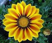
     They remind us of the sun or fire and can add a feeling of excitement, boldness or happiness to a work of art. Warm colours make objects seem larger and appear to advance in an artwork. 
                                                               Yellow              Red
                                                               Orange            Brown
                                                                           Magenta

COOL COLOURS
     They remind us of lakes, distant mountains, sky and foliage. Cool colours tend to be calm and restful. They recede into the distance and make object smaller.

Green                   Black
Blue                      Grey
Purple                  White
                        
Colour temperature and Art
     Artists have been using one side of the colour palette to express differents feelings. There are painters, like Picasso, that went through fases along their lives depending on their moods. They choose a cool or warm palette.

    
Klimt
Matisse

Picasso
Picasso


Sorolla
Sorolla

Compare the diferences between these paintings. 
  
Colour temperature and Design

 In Graphic design as well as in Decoration we can find examples of Cool or warm colours.


Why do they choose these colors in this two ads?

What do you feel when you see these two rooms? Which one do you like best? Why?

Try the multicolor search lab for mixing colours and see which images come up!

View this short video about cool and warm colours from Art Attack.

Friday 3 February 2012

The Colour Wheel

     The Colour Wheel or color circle can help us understand the use of colour in art, illustration and design.
     The Colour Wheel shows primary, secondary, tertiary, warm, cool and complimentary colours as used in colour theory when painting.

Mesa Color

Paint your own Colour Wheel
Begin a color wheel by drawing a circle and divide it in 12 parts.
First,  paint with the primary colors in the 100%.

Then we are going to mix the two primary to get the secondary colors.

Finally we mix the primary colors of two by two, one of them 100% and the other 50 %.
  
There are different shapes for the Colour Theory.

Thursday 2 February 2012

Shape. Symmetry

 Questions 
  1. Why learn about symmetry? 
  2. What do you notice about shapes or designs that have symmetry?
  3. Does it make a difference if the line of symmetry is vertical or horizontal? Why or why not?
  4. Locate two objects in the classroom: one that has symmetry and one that has not. Explain the differences.
-->   Symmetry is perhaps most familiar as an artistic concept than a math concept. Designs are said to be symmetric if they exhibit specific kinds of balance, repetition an harmony.


Think of the form of a butterfly; its right and left halves mirror each other. If you knew what the right half of a butterfly looked like, you could construct the left half by reflecting the right half over a line that divides the butterfly.
A line of symmetry divives a figure into two halves that are the mirror images of each other.
See the difference between both trees.


Types of symmetry_____________________________________________

Plane symmetry involves moving all points around the plane so that their positions relative to each other remain the same, although their absolute positions may change. Symmetries preserve distnces, angles, sizes, and shapes.
  • Rotation by 90 degrees about a fixed point is an example of a plane symmetry.
  • Reflection of a figure is when seen in a mirrow or atransparent surface. Another way to make a reflection is to fold a piece of paper and trace the figure onto the other side of the fold.
  • Traslation it is like moving the shape over and it is exactly the same the whole time. It just repeats and repeats.


1. Reflexion symmetry__________________________________________
  Miror symmetry is present whenever an object or design can be broken down into two parts, one of which is the reflection of the other.


Reflection symmetry is quite common in nature and art.


2. Rotational symmetry_______________________________________
      An object that has rotational symmetry will appear unchanged if rotated through an angle. A circle can be rotated any amount and still look like a circle, but most objects can be rotated only by some specific amount, depending on the design.


To know more about symmetry click here. If you want to play chek this: Game. Try it!

Exercises____________________________________________________________
  1. Make strings of paper dolls or snowflakes by cuttinh a strip of folded paper to show an easy way of creating symmetry. There is a program that allows you to create your own snowflake.
  2. Answer the questions in your woorksheet after watching this Power Point Presentation: Symmetry/yrtemmyS
  3. Exercises with axial symmetry.
  4. Exercices with radial symmetry.
  5. Working with your name
Teachers_____________________________________________________________

Wednesday 1 February 2012

Colour pigment

Questions:
   • What is a pigment?
   • What do you know about colour? Name me some colours.
   • Which colour do you like best? Why?

Pigments
 Colour_______________________________________________________
      Colour is everywhere. In our clothes, the sky, trees, flowers, billboards designed to attract our attention, on the web and on television.

      Definition: (noun) - Colour is the element of art that is produced when light, striking an object, is reflected back to the eye.
 
“COLOUR IN A PICTURE IS LIKE ENTHUSIASM IN LIFE” Picasso


     Colours can also be symbolic, with meanings that change from culture to culture. A colour can symbolize an object or thing such as blue for water and green for grass and the leaves of trees or it may symbolize an emotion or idea, such as red for love, yellow for fear and blue for sadness. A trained artist is familiar with all of these options and can select and combine colours to create a desired impression or to evoke a certain mood.

1. Colour has 3 characteristics:
  • Hue is actually the colour we see—such as red. 
  • Intensity o saturation refers to the brightness or dullness of a colour (the degree to which grey has been added to a colour). The pure hue has the highest saturation 
  • Value refers to the lightness and darkness of a particular colour. We can divide these value changes into shades and tints.
              a. Tints; where white is added to a colour. Tints are the lightness of a colour.
              b. Shades; where black is added to a colour. Shades are the darkness of a colour.
       It is a way of representing the chromatic scale in a circle using all the colours made with. It describes the relationships between colours.
  • Primary colours are basic and cannot be mixed from other elements. They are: magenta, yellow and cyan.
  • Secondary colours are mixed from two primaries next to each other on the colour wheel. They are green (yellow and blue combined), purple (magenta and blue combined) and red (magenta and yellow combined). You will notice that each secondary colour on the Colour Wheel is bounded by two primaries.

3. Colour Schemes:
The colour schemes are ways colours are put together in an “intelligent way”:
  • Monochromatic: literally means one (mono) colour (chroma). So a monochromatic colour scheme is made up of one colour and it’s shades and tints
  • Polychromatic: literally means several (poly) colour (chroma). So a polychromatic colour scheme is made up of 2 or more colours.
  • Analogous: are colours that are next to each other on the colour wheel. 
  • Complementary: are colours found directly across from each other on the colour wheel. Complementary colours provide strong contrast. They also help to make each other more active.
 
Complementary colours
 4. Colour Temperatures:
Have you ever noticed that colors seem to have different temperatures?
  • Reds, Oranges and Yellows are Warm Colours. They remind us of the sun or fire and can add a feeling of excitement, boldness or happiness to a work of art. Warm colours make objects seem larger and appear to advance in an artwork.
  • Greens, Blues, and Violets are Cool Colours. They remind us of lakes, distant mountains, sky and foliage. Cool colours tend to be calm and restful. They recede into the distance and make objects seem smaller.

Check your knowlege on colours playing this game: Colour

Colour light versus Colour pigment

Questions:
   •  What does colour mean?
   •  Would we see the colour without light?
   •  When do you see a rainbow? Why?
   •  Do all the animals see the same colours? And what about people?

Light and Vision_____________________________________________________

     The Colour spectrum: The familiar colors of the rainbow in the spectrum – named using the Latin word for appearance or apparition by Isaac Newton in 1671 – include all those colors that are visible to the human eye. 
      The ability of the human eye to distinguish colours is based upon the varying sensitivity of different cells in the retina to light of different wavelengths. The colour that we see is the result of a part of the visible spectrum that is reflected. We see a red apple because only that part of the spectrum is reflected. Black occurs because all the colours of the spectrum are absorbed rather than being reflected.

     If one or more types of a person's colour-sensing cones are missing or less responsive than normal to incoming light, that person can distinguish fewer colours and is said to be colour deficient or colour blind.
 
B
A


On the left the colours of the rainbow as viewed by a person with no colour vision deficiencies.
On the right the colours of the rainbow as viewed by a person with colour blindness.

Organic and geometric shapes

ORGANIC and GEOMETRIC SHAPES___________________________________

    A shape is an element of art. Specifically, it is an enclosed space, the boundaries of which are defined by other elements of art (i.e.: lines, colours, values, textures, etc.). Shapes are limited to two dimensions: length and width.

    1. Geometric shapes:
  • Are circles, rectangles, squares, triangles and so on - have the clear edges one achieves when using tools to create them. 
  • Most geometric shapes are made by humans, though crystals are also considered to be geometric despite the fact that they are made in nature. 
   2. Organic shapes:
  • Are shapes with a natural look and a flowing and curving appearance. 
  • Organic shapes and forms are typically irregular or asymmetrical.  
  • Organic shapes are associated with things from the natural world, like plants and animals.

Artists use organic shapes and geometric shapes in different ways:
  1. When attempting to create a piece that looks natural, flowing, soft or calming, organic shapes are generally the shapes of choice.
  2. When attempting to create a sense of chaos, anger, or rigidity, geometric shapes are used. Geometric shapes may also be used to create abstract interpretations of things that would normally be depicted as organic shapes.
Check the Artist's Toolkit webpage to learn more.

Exercise___________________________________________________________________

Make a composition with Organic and Geometric Shapes.